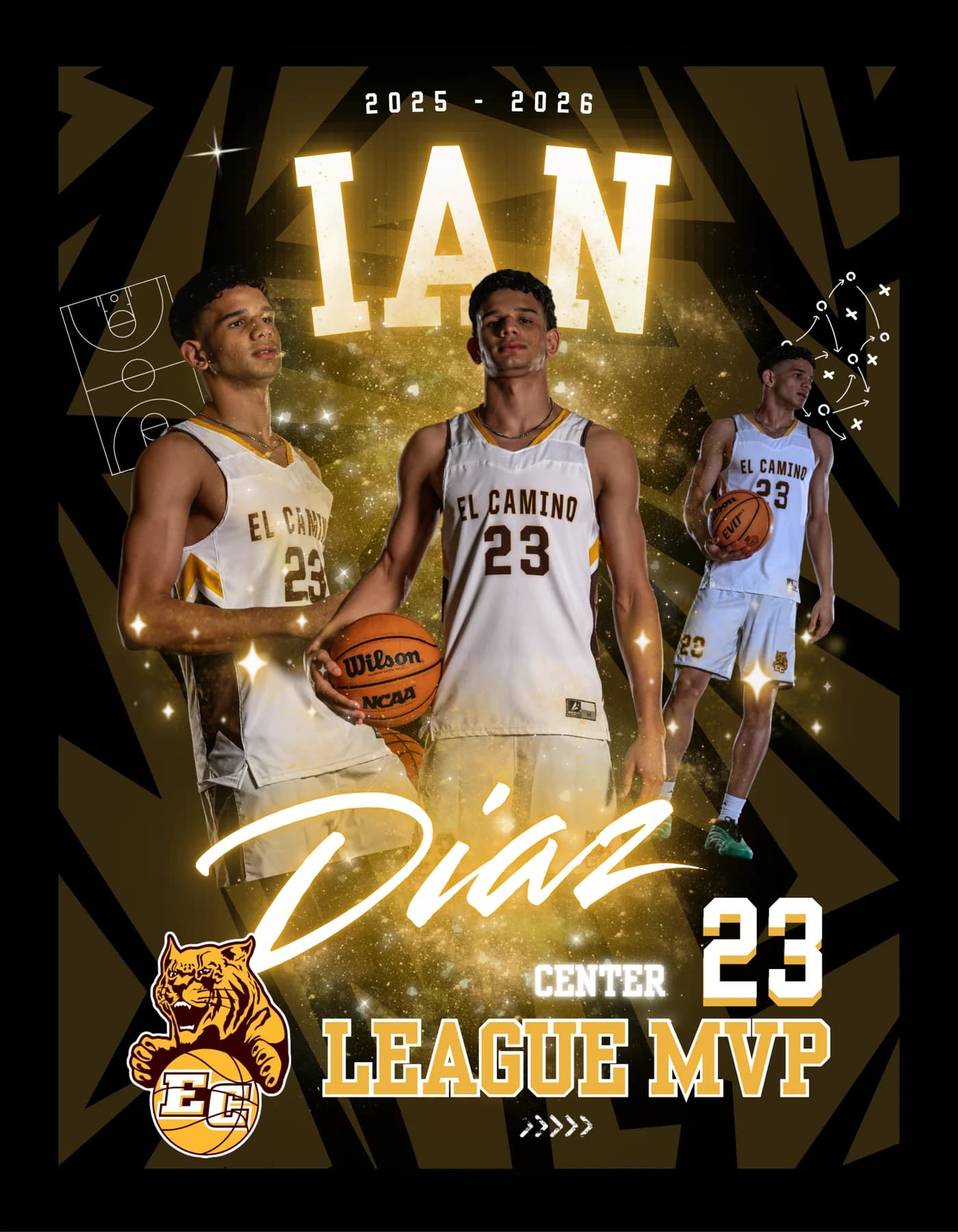
01
One mark, everywhere it has to live
Brand Identity · Programs and small businesses · Named examples on the portfolio
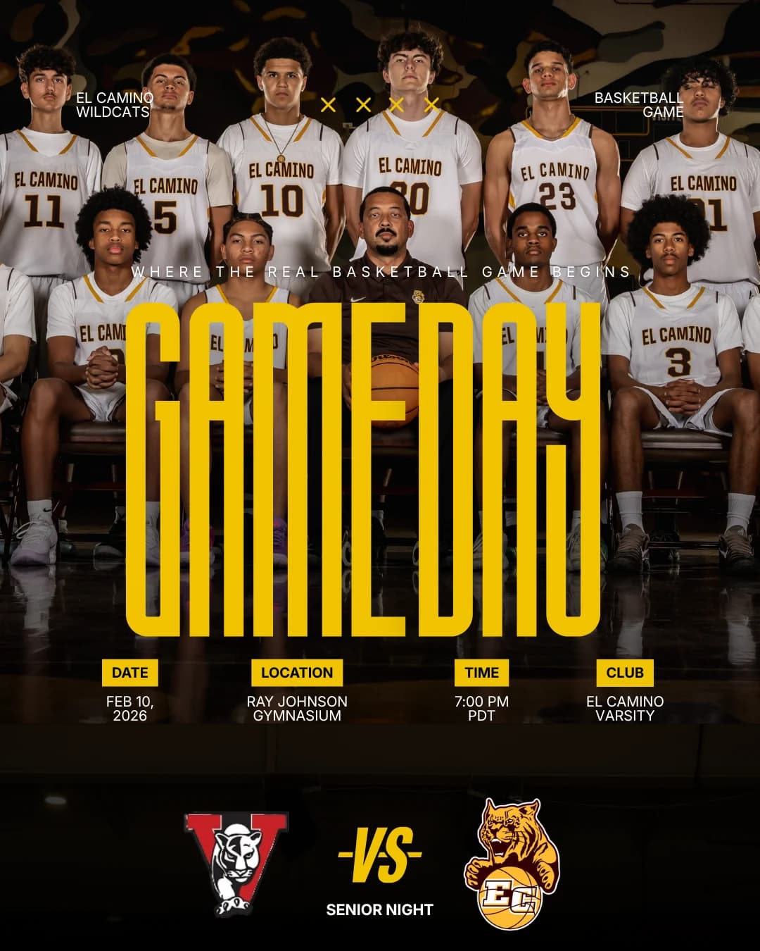
- Logo & monogram
- Color & type system
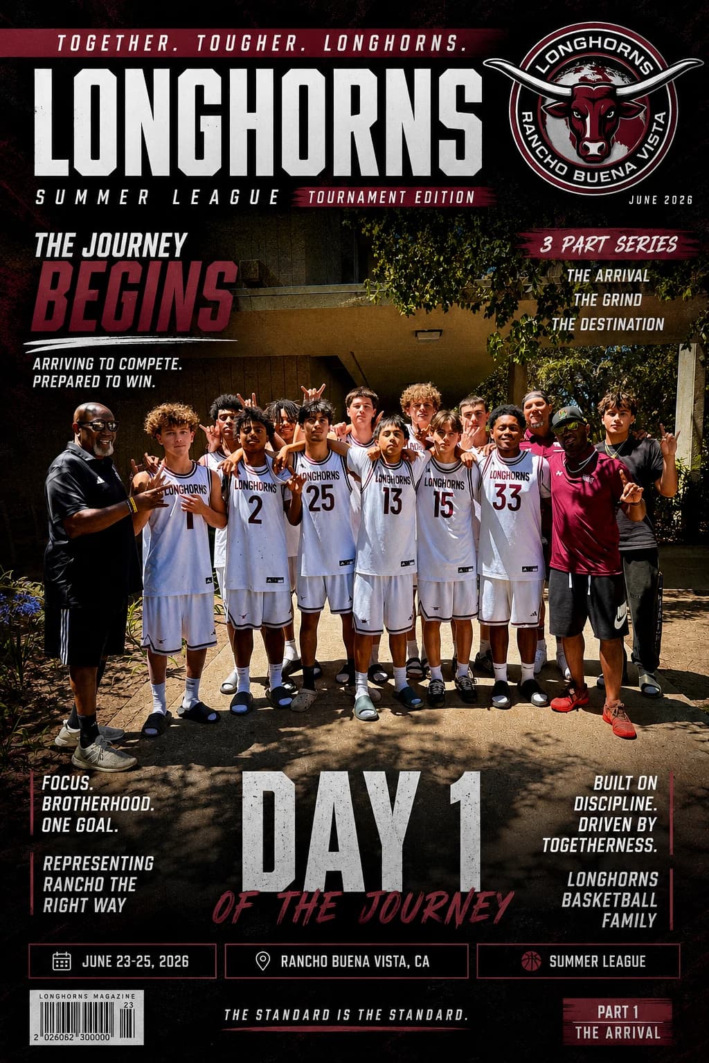
- Uniform / kit direction
- Brand guidelines
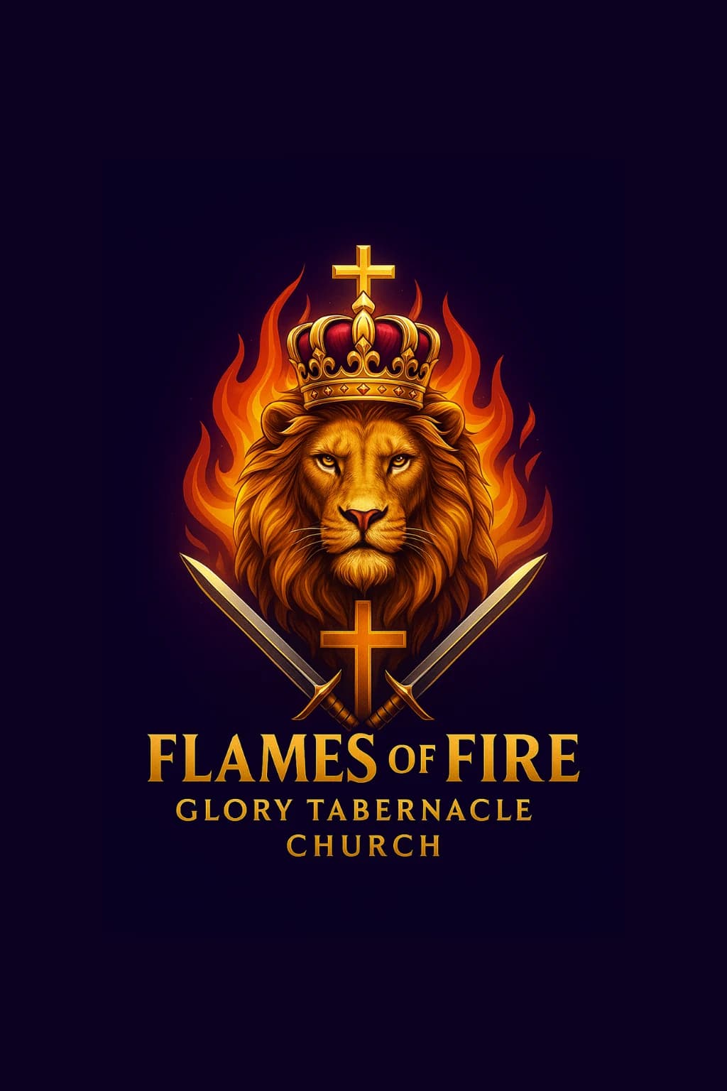
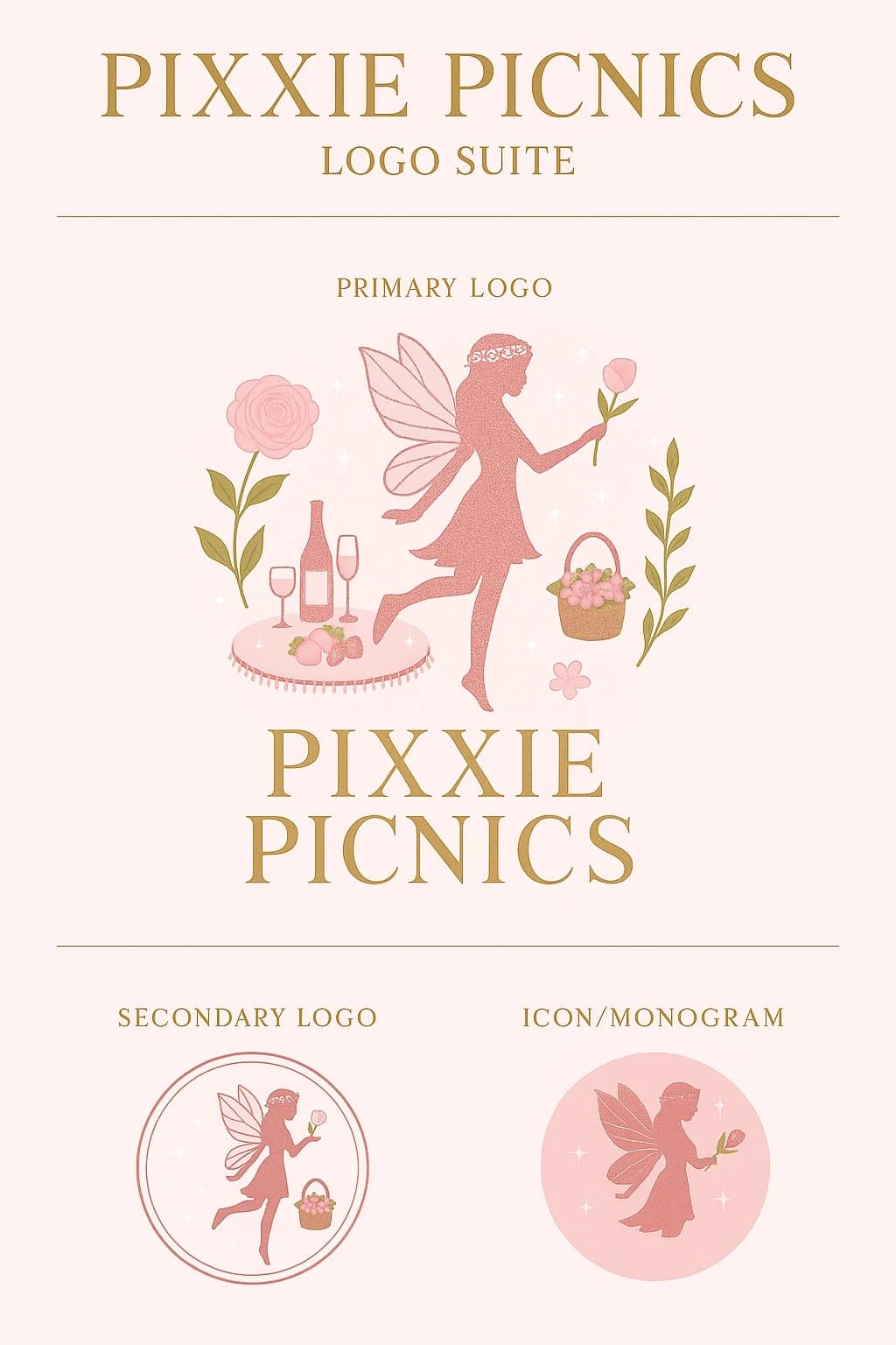
The constraint
A mark has to survive its worst reproduction, not its best one. The same artwork has to hold embroidered at chest size, printed one-color on a practice tee, and cropped square for an avatar — and then get handed to people who will use it for years without me in the room. The screen it was drawn on is the easiest test that mark will ever face, and it's the only test most marks get.
The call I make
I approve a mark at its smallest real application before its largest. The easy default is to sign off at the size it was designed at, where every detail survives, and to lead with an illustrated character because that's the piece everyone loves in the presentation. It's also the piece nobody can stitch. I'd rather lose the first reveal than rebuild an identity after the uniforms are ordered.
What it produces
- One file set covers stitching, print, and screen, so nobody has to guess which version to send.
- The version signed off is the version that survives the jersey, because it was tested there first.
- Written guidelines go out with the files, so the identity still holds when someone other than me makes the next graphic.